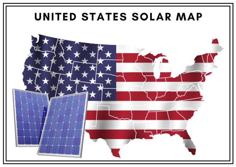

The United States solar map to discover your region’s solar potential and maximize renewable energy opportunities.
The golden rays stretching across America’s vast landscapes are not just scenic they are powerful. From the sun-drenched deserts of Arizona to the surprisingly productive solar corridors of New England, our nation possesses an incredible solar resource waiting to be tapped. Understanding the United States solar map is not just academic it is practical knowledge that can slash your energy bills, boost your property value, and help you contribute to a cleaner future.
Whether you are a homeowner considering rooftop panels, a business evaluating renewable energy options, or simply curious about America’s clean energy potential, this comprehensive guide to the United States solar map will illuminate the bright spots and practical applications of solar energy across the country.
Table of Contents
At a Glance: United States Solar Resource Map Highlights
Before diving deeper, let’s examine the essential solar potential across different regions of the United States:
| Region | Average Annual Solar Radiation (kWh/m²/day) | Solar Potential Rating | Best Applications |
| Southwest | 5.5-6.8 | Excellent | Utility-scale, residential, commercial |
| Southeast | 4.5-5.5 | Very Good | Residential, commercial |
| Midwest | 4.0-5.0 | Good | Rural installations, community solar |
| Northeast | 3.8-4.5 | Moderate to Good | Residential with incentives, commercial |
| Northwest | 3.5-4.5 | Moderate | Residential with storage, grid support |
| Alaska | 1.5-3.5 | Limited | Off-grid applications, summer generation |
| Hawaii | 5.5-6.0 | Excellent | Residential, commercial, grid support |
This United States solar map summary demonstrates that viable solar opportunities exist nationwide, not just in the famously sunny regions.
The Science Behind Solar Maps
How Solar Resource Maps Are Created?
The National Renewable Energy Laboratory (NREL) and other research institutions create United States solar maps through a fascinating process combining satellite data, ground measurements, and sophisticated modeling.
These maps do not simply track sunshine hours. They measure:

- Direct Normal Irradiance (DNI) – sunlight reaching the earth without being scattered
- Diffuse Horizontal Irradiance (DHI) – scattered sunlight reaching horizontal surfaces
- Global Horizontal Irradiance (GHI) – total solar radiation on a horizontal surface
Scientists gather decades of weather data, analyze cloud patterns, and account for atmospheric conditions to develop these detailed United States solar maps. The result? Remarkably accurate predictions of solar energy potential down to specific coordinates.
Reading a Solar Irradiance Map
When examining a United States solar map, the colors tell an important story. Typically:
Deep reds and oranges indicate exceptional solar resources (6+ kWh/m²/day) Yellows represent good solar potential (4.5-5.5 kWh/m²/day) Greens show moderate resources (3.5-4.5 kWh/m²/day) Blues indicate lower solar potential (below 3.5 kWh/m²/day)
Remember that even “lower” potential regions can still produce significant solar energy—just with slightly larger systems or different optimization strategies.
Regional Breakdown: America’s Solar Landscape
The Solar Southwest: America’s Sunshine Powerhouse
The southwestern United States—spanning Arizona, New Mexico, Nevada, Southern California, and western Texas—dominates the United States solar map for good reason. With clear skies, minimal precipitation, and high altitude, this region receives extraordinary solar radiation.

The Mojave Desert hosts multiple utility-scale solar installations, including the impressive 392 MW Ivanpah Solar Electric Generating System. Meanwhile, residential solar adoption in Phoenix, Las Vegas, and Albuquerque continues to accelerate thanks to exceptional year-round production potential.
This region’s only solar challenge? Extreme heat can actually decrease panel efficiency, requiring specific high-temperature-tolerant equipment.
Southeast Solar: Humidity Doesn’t Dampen Potential
Don’t let afternoon thunderstorms fool you—the southeastern United States offers excellent solar potential. Florida, Georgia, and the Carolinas receive substantial solar radiation, with the added benefit of winter production far exceeding northern states.
The United States solar map shows this region averaging 4.5-5.5 kWh/m²/day—plenty for cost-effective installations. Florida alone added over 3.9 GW of solar capacity between 2020-2023, demonstrating the region’s growing recognition of its solar resources.
The Northeast’s Solar Surprise
Perhaps the biggest surprise on the United States solar map is the Northeast’s impressive solar viability. Despite shorter winter days and more cloud cover, states like Massachusetts, New York, and New Jersey have embraced solar enthusiastically.
Why? Strong incentives and high electricity rates make the financial case compelling even with somewhat lower production. Massachusetts’ SMART program and New York’s NY-Sun initiative have transformed the region into a solar leader despite its northern latitude.
Snow can actually help production by reflecting additional light onto panels once it melts off their slick surfaces—a silver lining to winter weather!
Midwest Solar: The Emerging Frontier
America’s heartland shows promising yellows and greens on the United States solar map. While not matching the Southwest’s intensity, states like Minnesota, Illinois, and Ohio receive ample solar radiation—especially during long summer days.
Community solar has found particular success here, allowing farmers to diversify income while continuing agricultural activities beneath and between panel arrays. This “agrivoltaic” approach turns solar from a land competitor into a complementary resource.
Pacific Northwest: Working With Challenges
The cloudiest region on the United States solar map still offers viable solar opportunities. Washington, Oregon, and northern California benefit from exceptionally long summer days and electricity rate structures that reward clean energy.
Interestingly, the region’s cooler temperatures actually improve panel efficiency, partially offsetting reduced sunlight. Seattle residents might be surprised to learn their annual solar production exceeds parts of Florida during summer months—it is the dark winters that reduce annual totals.
Practical Applications of United States Solar Maps
For Homeowners: How to Use Solar Maps for Your Property
Before installing solar panels, smart homeowners consult the United States solar map for their specific location. This information helps:
- Size your system appropriately: Areas with lower irradiance may need additional panels to reach production goals.
- Calculate realistic payback periods: Understanding your region’s solar resource improves financial forecasting.
- Determine optimal panel orientation: While south-facing is standard, western orientation may be better in some regions with afternoon production incentives.
- Select appropriate equipment: High-efficiency panels matter more in moderate solar regions, while durability might be the priority in extreme climates.
Online tools like NREL’s PVWatts Calculator use United States solar map data to provide customized estimates for your exact address—an invaluable resource for solar planning.
For Businesses: Strategic Solar Implementation
Commercial enterprises use United States solar maps to make data-driven renewable energy decisions. Large retailers like Target and Walmart analyze these maps to prioritize solar installations across their nationwide footprints, targeting high-production regions first.
For businesses with multiple locations, the United States solar map guides:
- Capital allocation for renewable projects
- Power purchase agreement (PPA) negotiations
- System design specifications
- Tax incentive maximization strategies
The most sophisticated companies combine solar map data with electricity rate information, demand patterns, and incentive programs to optimize their renewable energy investments.
The Future of America’s Solar Landscape

Emerging Trends Changing the Map
The United States solar map is not static—it evolves with technological advances and policy changes. Several trends are reshaping America’s solar landscape:
Bifacial panels that capture reflected light from both sides are expanding viable solar territory into regions previously considered marginal. These panels perform exceptionally well in snowy regions and areas with reflective surroundings.
Solar-plus-storage systems are transforming solar viability nationwide. Even regions with shorter winter days can maximize self-consumption year-round with properly sized battery systems, improving economics dramatically.
Floating solar installations on reservoirs, lakes, and retention ponds are opening new territories not traditionally considered on the United States solar map, while providing the additional benefit of reduced water evaporation.
Climate Change Impacts on Solar Resources
Climate scientists are closely monitoring how changing weather patterns might alter the United States solar map in coming decades. Initial research suggests:
- The Southwest may experience more dust storms and haze, potentially reducing solar radiation
- The Southeast could see increased hurricane activity and resultant cloud cover
- The Midwest might benefit from reduced winter cloud cover in some areas
While these changes will develop gradually, they underscore the importance of robust system design that can adapt to evolving conditions.
FAQs About United States Solar Maps
Where can I find the most current United States solar map?
The National Renewable Energy Laboratory (NREL) maintains the most comprehensive and up-to-date United States solar maps. Their website offers interactive maps showing different types of solar radiation data across the entire country. Other reliable sources include NASA’s Atmospheric Science Data Center and the Solar Energy Industries Association (SEIA).
How much does solar potential vary across different states?
Solar potential varies significantly across the United States. The Southwest (particularly Arizona, Nevada, and New Mexico) receives about 60-70% more solar radiation than the Pacific Northwest or Northeast. However, even states with moderate ratings on the United States solar map often have strong solar programs thanks to high electricity prices and incentives.
Can I rely on solar power in cloudy regions?
Absolutely! Germany, which has a solar resource comparable to Alaska, was the world leader in solar adoption for many years. Modern solar systems produce significant power even in diffuse light. The United States solar map shows that nearly every region has sufficient solar resources for viable installations when properly sized and incentivized.
How do seasonal changes affect solar production on the United States solar map?
Northern states experience dramatic seasonal production swings, with summer generation often 3-5 times higher than winter output. Southern regions show more consistent year-round production. The United States solar map reflects annual averages, so understanding seasonal variations for your specific location is important for system design.
Do solar maps account for microclimate variations?
Large-scale United States solar maps typically can not capture neighborhood-level microclimates. Local factors like fog patterns, mountain shadows, or urban heat islands might create conditions different from regional averages. On-site assessment by qualified solar professionals can identify these variations.
Conclusion: Your Place on the Solar Landscape
The United States solar map tells a story of abundant opportunity. From the blazing deserts of the Southwest to the varied climate of the Northeast, America possesses tremendous solar resources waiting to be harnessed.
Understanding your location on this national solar landscape is the first step toward making informed energy decisions. Whether you are motivated by environmental concerns, energy independence, or simple economics, the United States solar map offers valuable guidance for your renewable energy journey.
As technology advances, policies mature, and installation costs continue falling, the solar potential of every region on the map grows brighter. The question is not whether your location has sufficient solar resources—it is how best to capture the abundant energy raining down each day.
The United States solar map is not just a scientific tool. It is a roadmap to a cleaner, more resilient energy future—one rooftop at a time.